When faced with the challenge of an outdated learning platform which was not mobile responsive, Ove Ritola & Timo Salonen from the University of Vaasa, decided that they should use Moodle to create an enhanced dashboard for use by their educators and learners.
Ove and Timo talked about their Moodle story at the recent MoodleMoot UK & Ireland 2017.
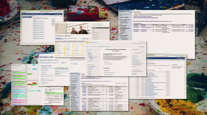
In their presentation, Ove and Timo discussed how their project began – when students at the University of Vaasa, Finland, experienced difficulty accessing their data that was scattered across several systems.
Of course, this made data collection time-consuming and difficult for their university.
Ove, Timo and their team improved the user experience of their learning platform by combining students’ information into one location. By doing this, students got more time to focus on the most important thing – their studies.
The first step of their project was deciding which system to build the dashboard on.
They chose Moodle.
Everything they needed was built inside Moodle’s theme “Clean”, allowing easy future upgrades.
The dashboard took six months to build and included PHP, MySQL, HTML, CSS, jQuery, JSON and, as Ove and Timo joked, duct tape!
What were the results?
Dashboard for students
Before the dashboard improvements, students saw a combination of outdated and unattractive systems which were difficult to navigate.
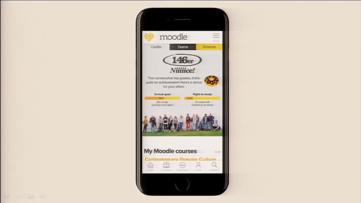
The new improved dashboard now is a user-friendly site, accessible via desktop and mobile devices.
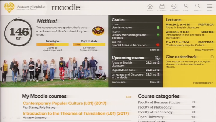
Focusing on user experience, the Moodle-hosted dashboard now also includes language options, dynamic search and navigation features.
In addition, it contains data pulled from the student information system (SIS) to be displayed as progress bars showing credit points, a timeline and more. Now students are able to instantly view important information.
Notifications such as upcoming exams, grades and lectures can be viewed by the student via dropdown menu, with quick links for easier access.
The addition of feedback forum in the dashboard is also enhancing user experience.
As Ove and Timo discussed this was an important aspect of the project; giving users the opportunity to comment on changes made and make suggestions. The feedback received prompted the team at the University of Vaasa to add the “hide courses” feature to the dashboard.
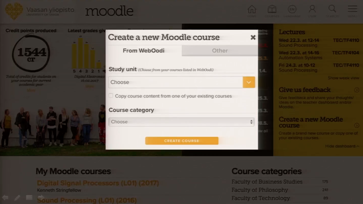
Dashboard for teachers
Ove and Timo also created an enhanced dashboard for teachers, which has the same design but contains different data, such as “exams to grade”, a colour-coded countdown and teacher-specific Moodle quick links.
Teachers can create a Moodle course directly from their dashboard and have the option of adding a new course with no content or to copy pre-existing Moodle course and editing it.
This aimed to reduce staff workload as previously assistance of Moodle admins were required to create courses.
Find out more tips on creating an enhanced and accessible learning experience with a Moodle dashboard by watch Ove and Timo’s presentation video.