The Moodle 4.0 new navigation prototypes are now finalised and we are excited to share a sneak peek of our new designs! Informed by an extensive discovery and consultation process with Moodle’s community of students, teachers, administrators, developers, partners and the Moodle Users Association, the new navigation is a foundation piece on the road to Moodle 4.0, the user experience centrepiece that will transform Moodle LMS.
Moodle has a new personality! We have designed a clean, fresh and contemporary interface that we are pleased to reveal in our new navigation prototypes. Alongside the rejuvenation of Moodle’s look and feel, our navigation has been reorganised to allow a more intuitive user experience. User testing indicated that guiding users to content and functionality shouldn’t be the job of one menu, and consequently, our primary navigation is now horizontal and has a small number of fixed categories.
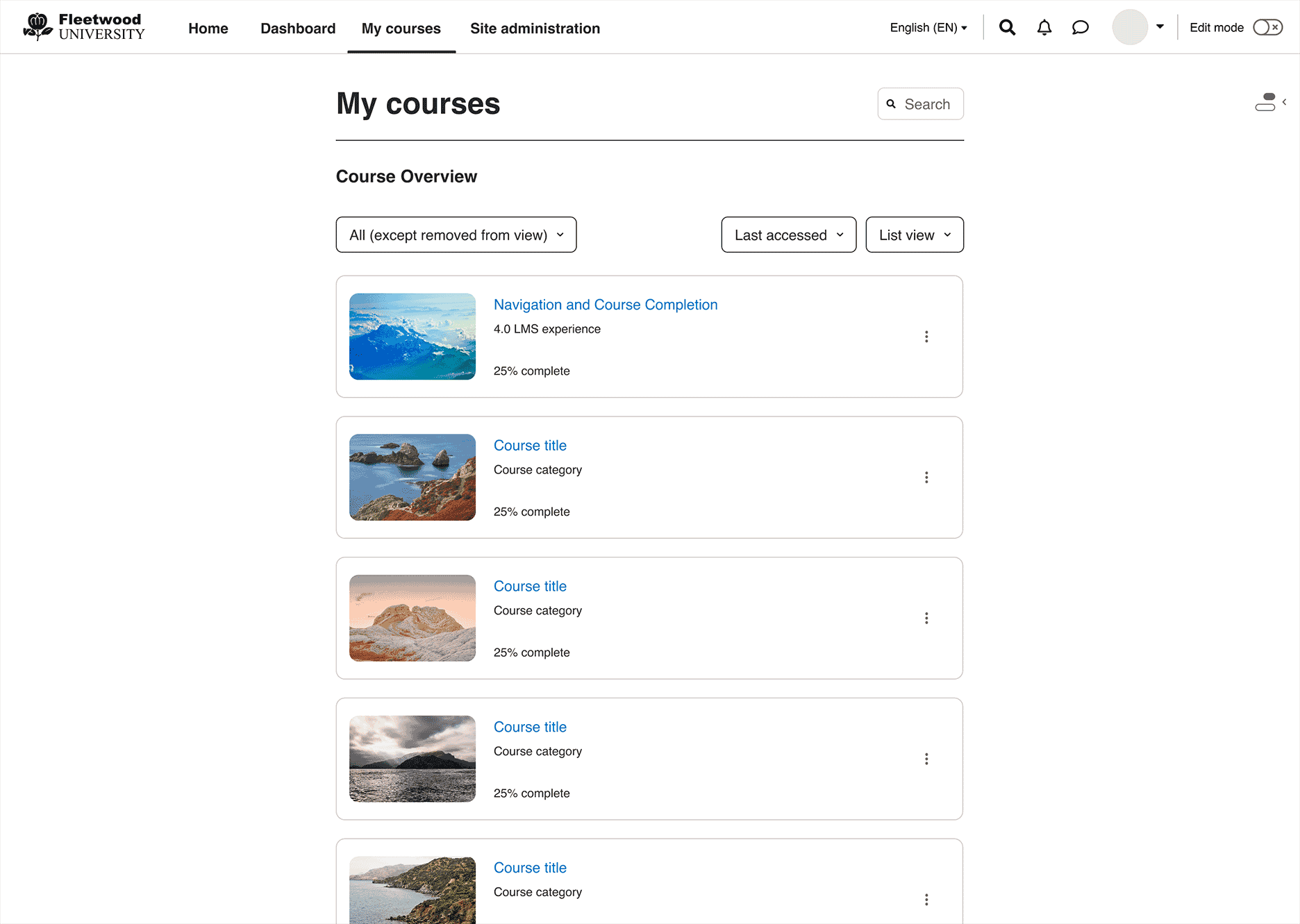
Experienced Moodlers will recognise many of the menu items, however we have also included a new addition to the default menu called “My Courses”. This is a stand alone dedicated page that will help educators and learners manage their courses. The default Course Overview page provides search and organisation functionality and has been moved from the Dashboard so that the dedicated dashboard space can be used for important dashboard tasks such as, “What do I need to do next?” and “How should I manage my time better?” It will allow the course page to be dedicated to helping users search, navigate, find and organise courses.
Moodle has a new personality! We have designed a clean, fresh and contemporary interface that we are pleased to reveal in our new navigation prototypes. (Click on image to make it larger)
The primary menu will still be customizable so that menu items can be added as additional items or dropdown categories.
A new secondary menu sits under the primary navigation components. As an example, the Course Page layout includes a secondary navigation piece that mirrors the design features and functionality of the primary navigation. These menu items have been re-prioritised from most to least important based on findings and data from qualitative and quantitative research. Consequently, the Settings menu items have been elevated to allow educators easy access to input and edit administrative detail about their course. Due to limitations of a fixed width column format, we have also incorporated an overflow button called “More” to allow users to navigate to lower prioritised menu items.
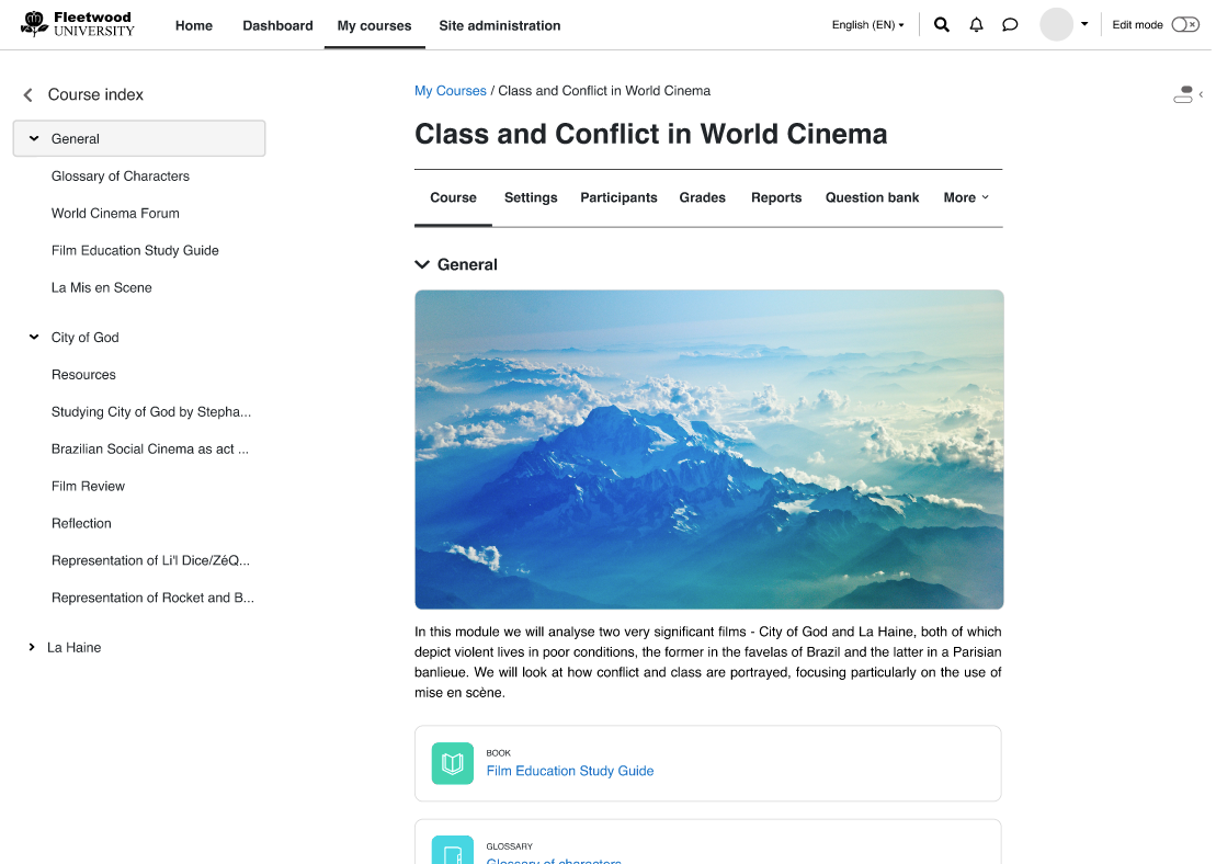
The new Course Index side draw can be expanded or collapsed depending on the preference of users. Click on image to make it larger
Another new icon component is located on the right hand side of the interface. When this button is clicked, Blocks relevant to the page become visible. Both the Course Index and Blocks icons can be revealed together, or users can toggle between them to reveal one at a time. By navigating to components or activities via the Course Index, the blocks that the component or activity relies upon is automatically opened. At the same time, the course index closes, which provides a clean and intuitive experience for learners.
The student experience has also been enhanced via improvements to the Course Completion components. A Moodle Users Association supported project, this feature will also be delivered in Moodle 3.11 scheduled for release in May 2021. As a learner navigates through a course page, they can view due dates or submission open and close dates against activities if the feature is enabled on the course. Another new feature is the inclusion of Badges that allow learners to visually see what the completion requirements for an activity are, and whether they have progressed them. The badges are automatically updated when the learner completes a required action.

Students can now see submission and due dates alongside badges that keep them up to date with what they need to do and what they have completed. Click on image to make it larger.
The UX navigation improvements are mirrored across desktop, tablet and mobile. Utilising hamburger menus that slide out to full screen, users can easily locate and access both primary and secondary menu items via the mobile interface. Components, blocks and the new course index can easily be navigated to via icons in key locations on the interface.

Hamburger menus that slide out to full screen allow users to easily locate and access both primary and secondary menu items. Click on image to make it larger.
Our UX and Moodle LMS development team are working in close collaboration through the project and in the extensive programming of the new navigation prototypes. Stay tuned for the release of our new Dashboard and Course Creation experience next month. In particular, we will unveil our new Edit feature which can be switched on and off from the right top corner of the interface.
There are exciting times ahead on the road to Moodle 4.0!!
For more information and video presentation on the Moodle 4.0 new navigation, please join the Moodle UX community, sign up to our usability testing and review our Moodle 4.0 documentation.